Overview
This case study was my submission to the 2022 Kleiner Perkins Fellows Program Design Challenge. I chose to redesign certain features of the DoorDash Dasher app to provide a better delivery experience for DoorDash delivery workers (aka Dashers).
Duration: Jan 5-9, 2022
Highlights
Personal Experience
In August of 2020, amid the pandemic I became a Dasher to make extra cash during my remote fall semester of college. Over the course of 1.5 years, I made over 200 deliveries.
As a lead user of the app, I was frustrated by its user experience and could especially empathize with complaints other Dashers have expressed online. Thus, I chose to redesign certain app features for this case study.
Research
Context
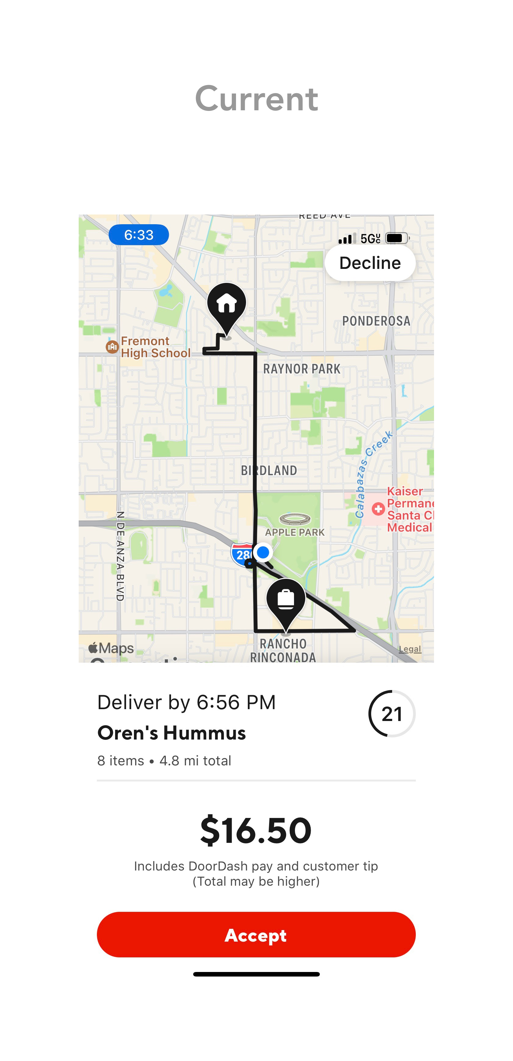
Dashers depend on the Dasher app to receive and fulfill order requests from DoorDash customers. It currently also allows Dashers to schedule dashes ahead of time, check their ratings, and keep track of their earnings.
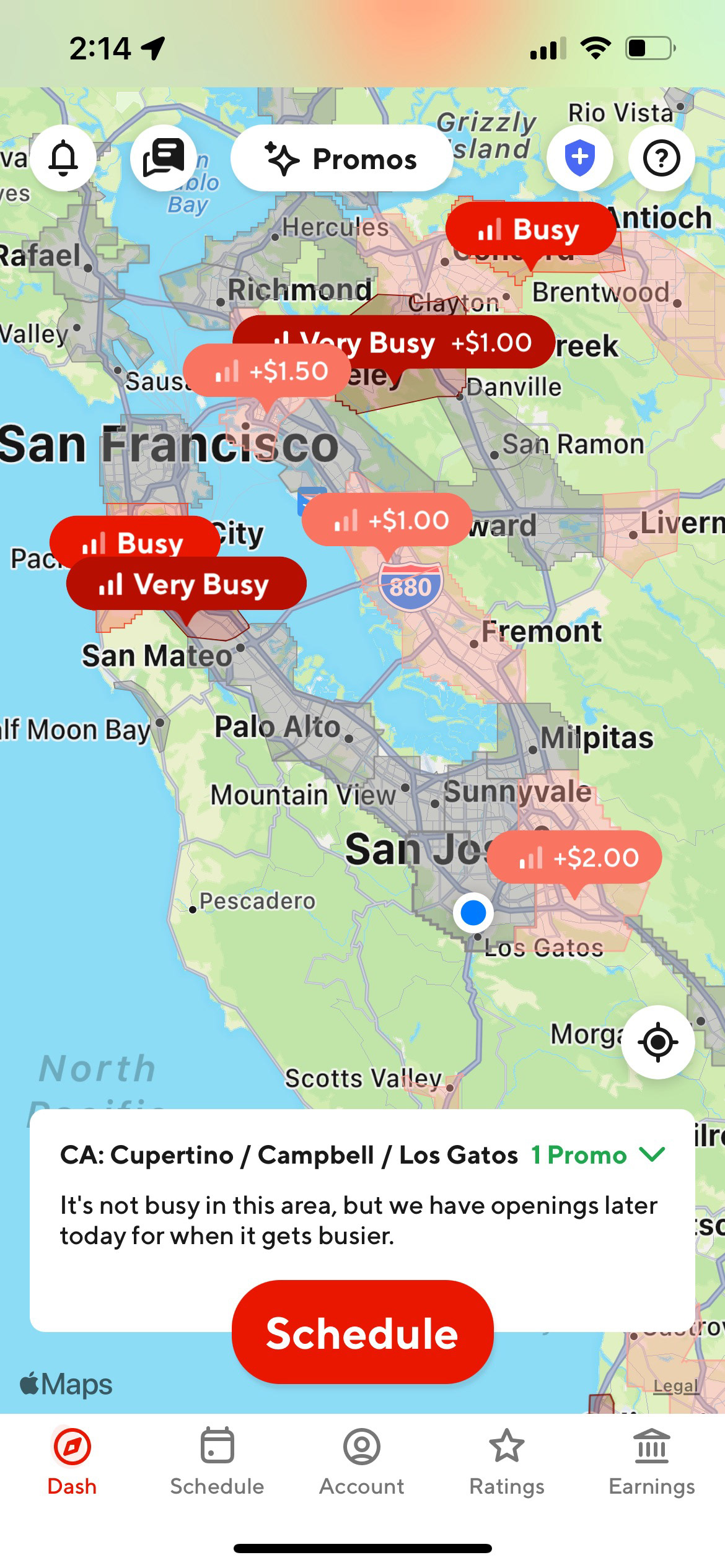
Home screen of the Dasher app
Online Feedback
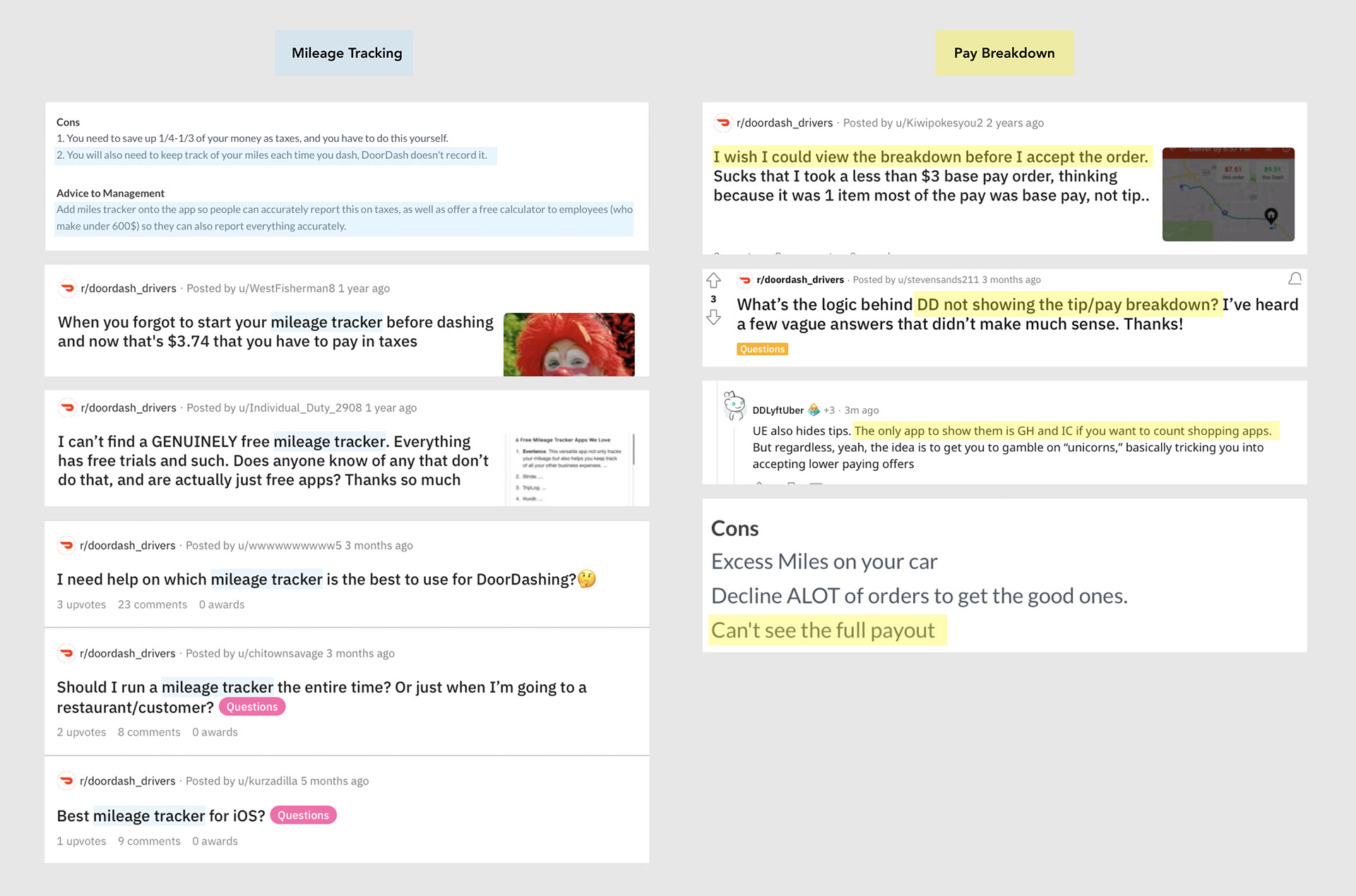
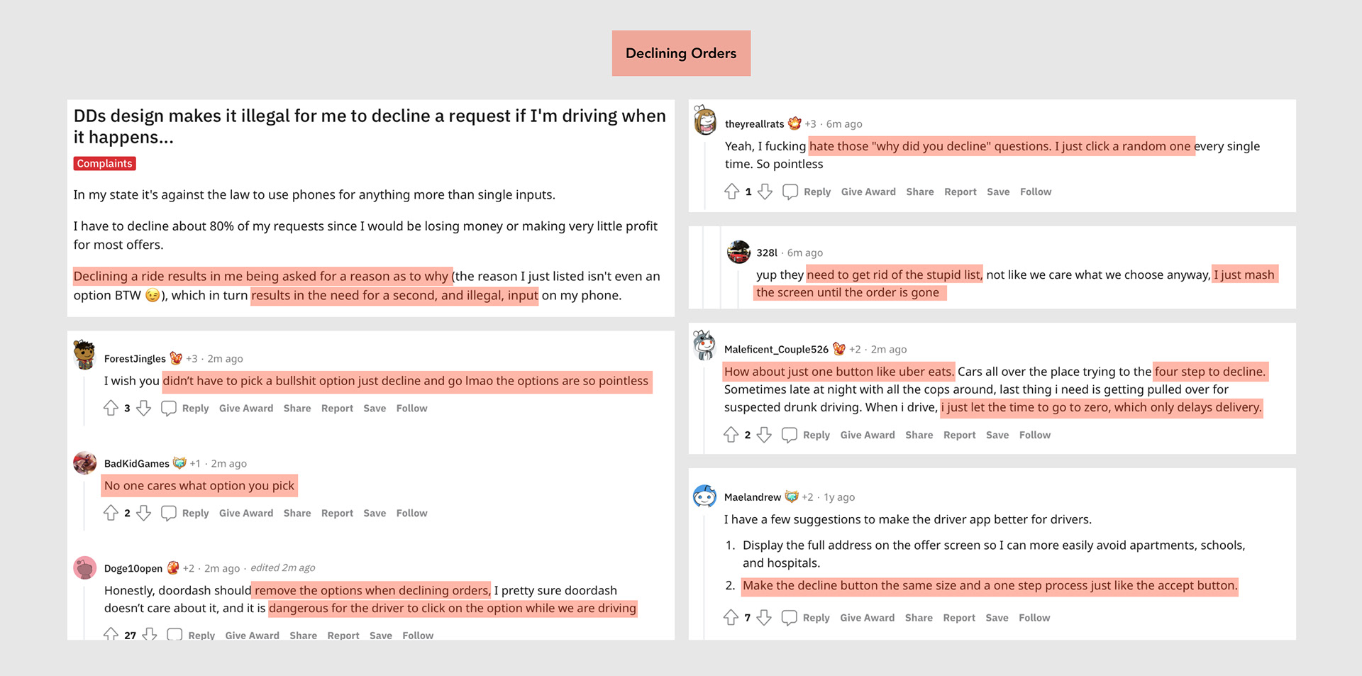
Users on r/doordash_drivers and Glassdoor complained most frequently about the following three problems:
• Needing a cheap, reliable method of tracking miles.
• Wanting to see the pay/tip breakdown before accepting an order.
• Becoming distracted or frustrated while declining an order request.
Secondary Research (Existing Data)
Clearly, knowing the pay breakdown of an order request is important for Dashers.
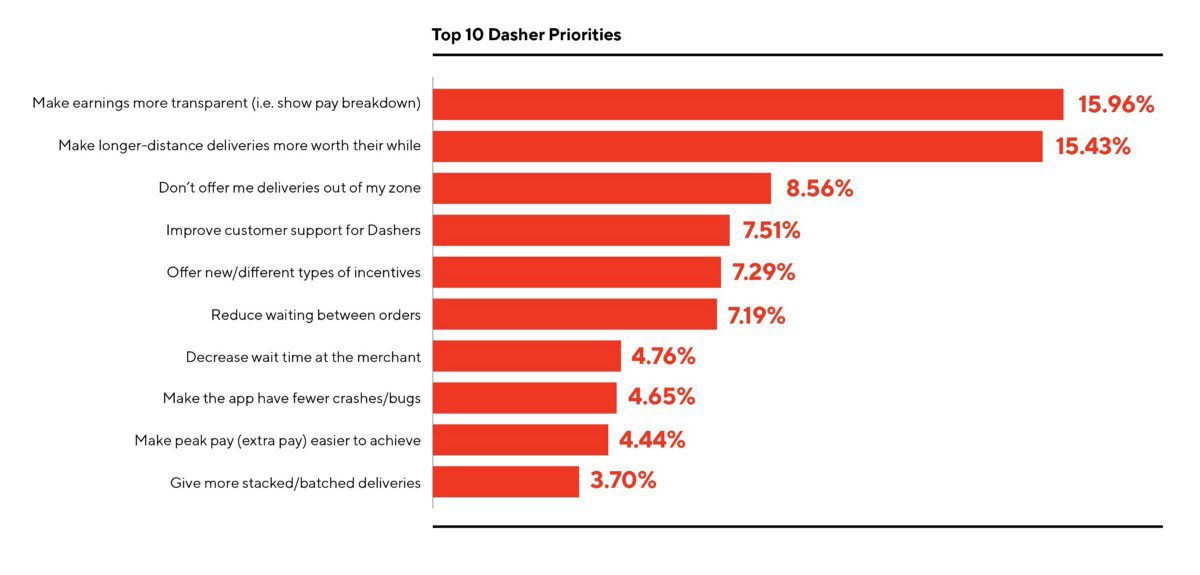
Source from DoorDash Medium Article by CEO Tony Xu
Primary Research (Google Form)
I conducted a Google form survey in which 22 past and present Dashers answered questions about their experience delivering food for DoorDash.
81.8%
Wanted the Dasher app
to have a built-in mile tracker.
77.3%
Wished to see an order's earnings breakdown
before accepting or declining it.
68.2%
Found the process to decline an order
while driving distracting or frustrating.
I asked Dashers why they usually declined orders.
90.9%
decline orders due to the distance being too far.
77.3%
decline orders due to the order being too small.
I also asked Dashers specifically why they would like to see their earnings breakdown immediately upon receiving an order request.
"It would help me understand where my money is coming from better on a per order basis."
"To know if the customer is tipping enough for the distance."
"I want to know the tip amount. I prefer higher tip orders as tip amount and customer courtesy seem to be closely related."
"DoorDash concealing the actual pay amount is a very concerning practice that I fundamentally disagree with."
Design Opportunities
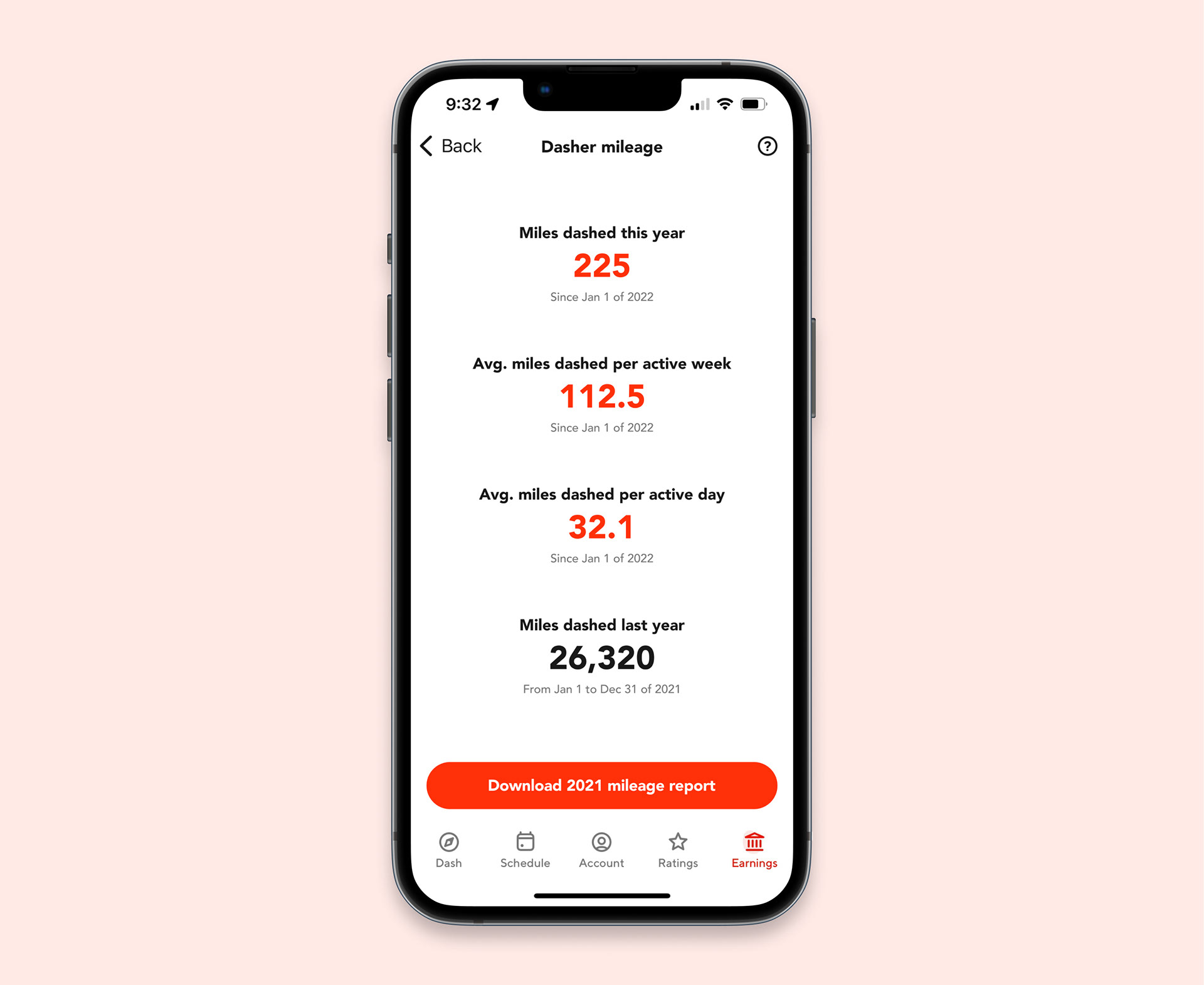
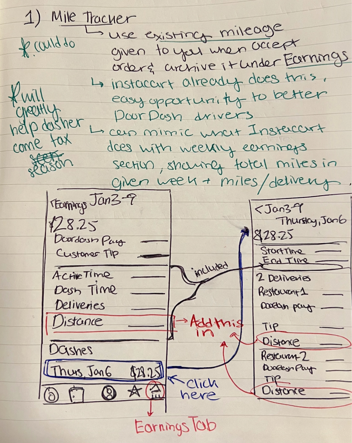
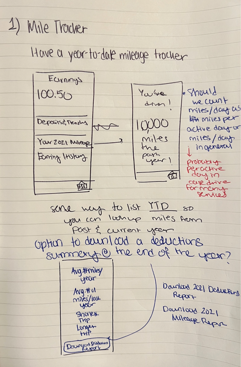
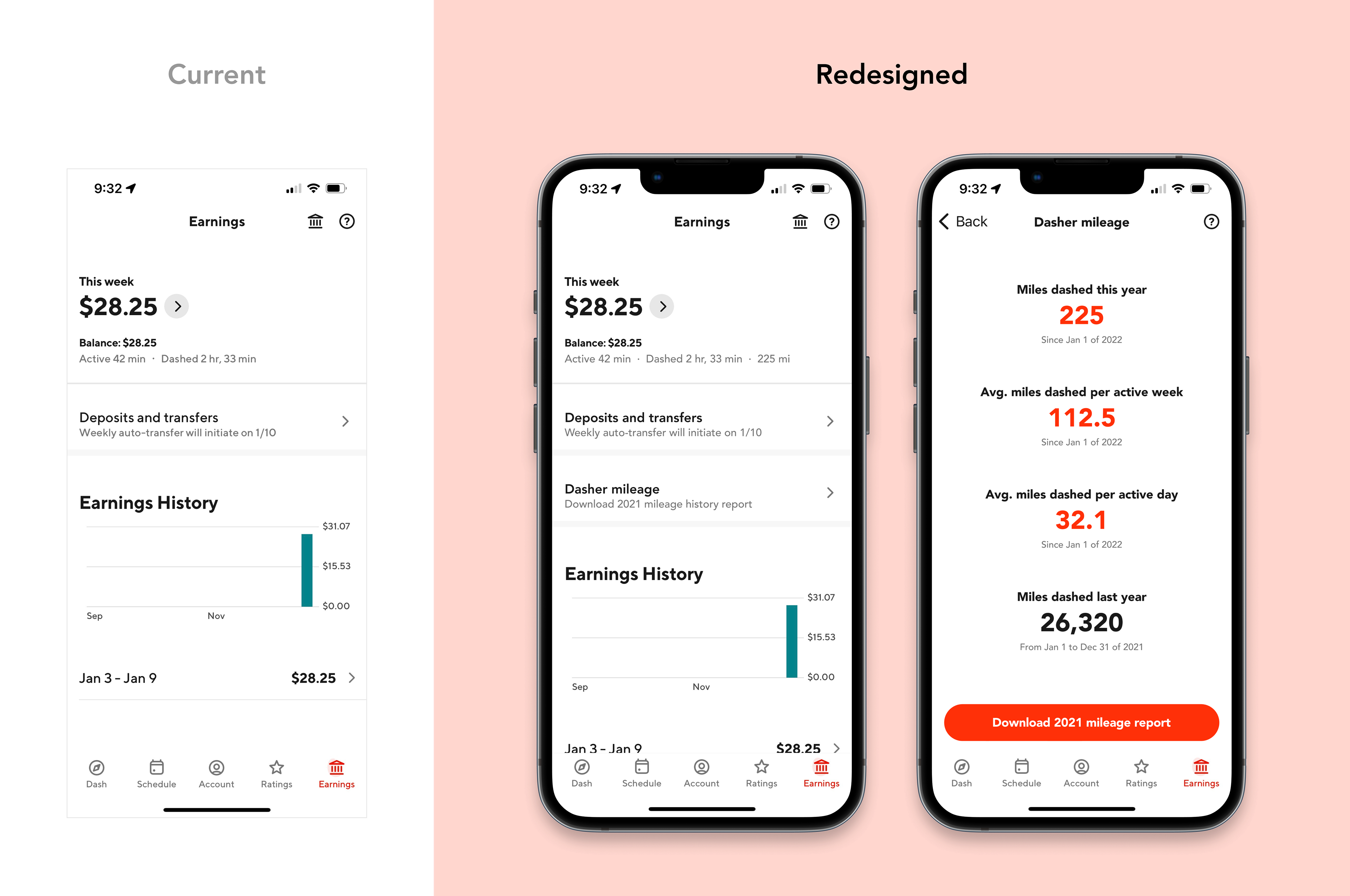
1. How might Dashers track their mileage more easily?
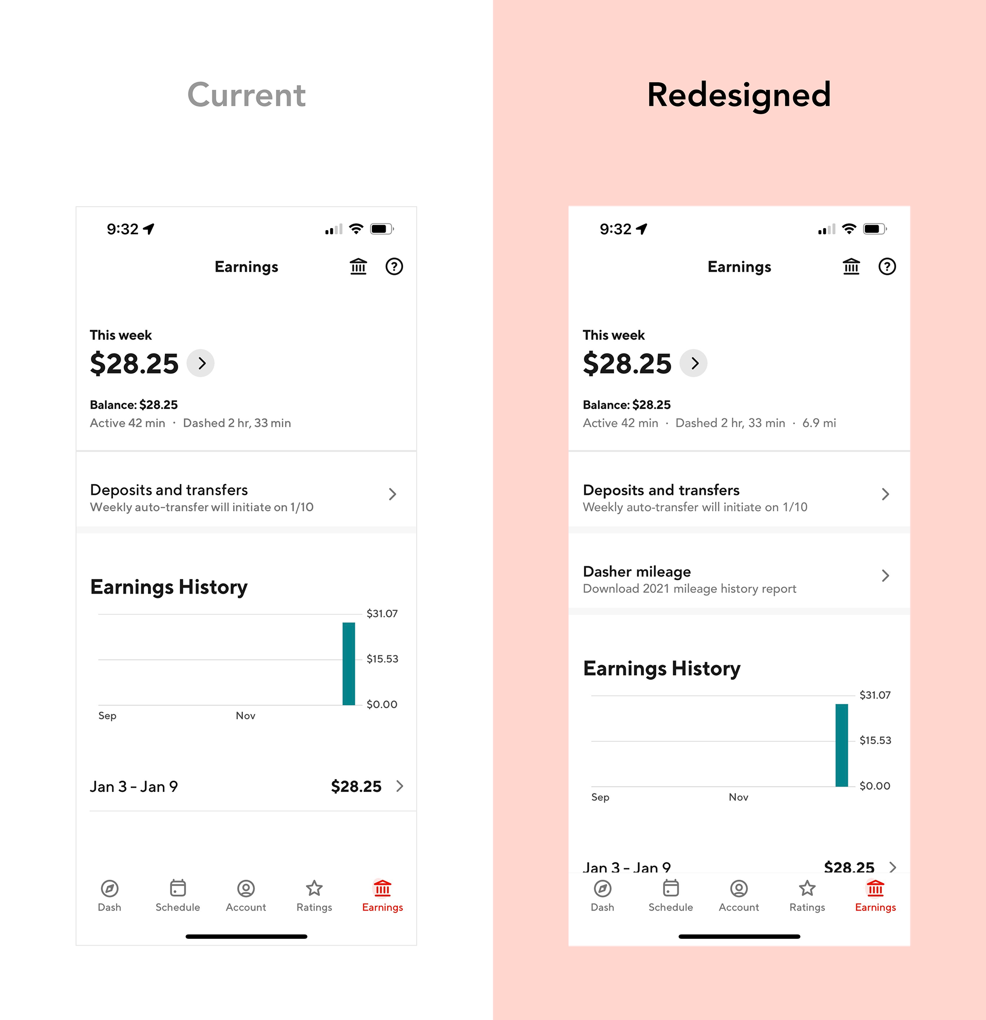
Despite showing the distance of each order pre-acceptance, DoorDash has no integrated mileage tracker that archives this information, forcing Dashers to pay for 3rd-party mileage tracking apps or manually track their miles for tax deduction purposes.
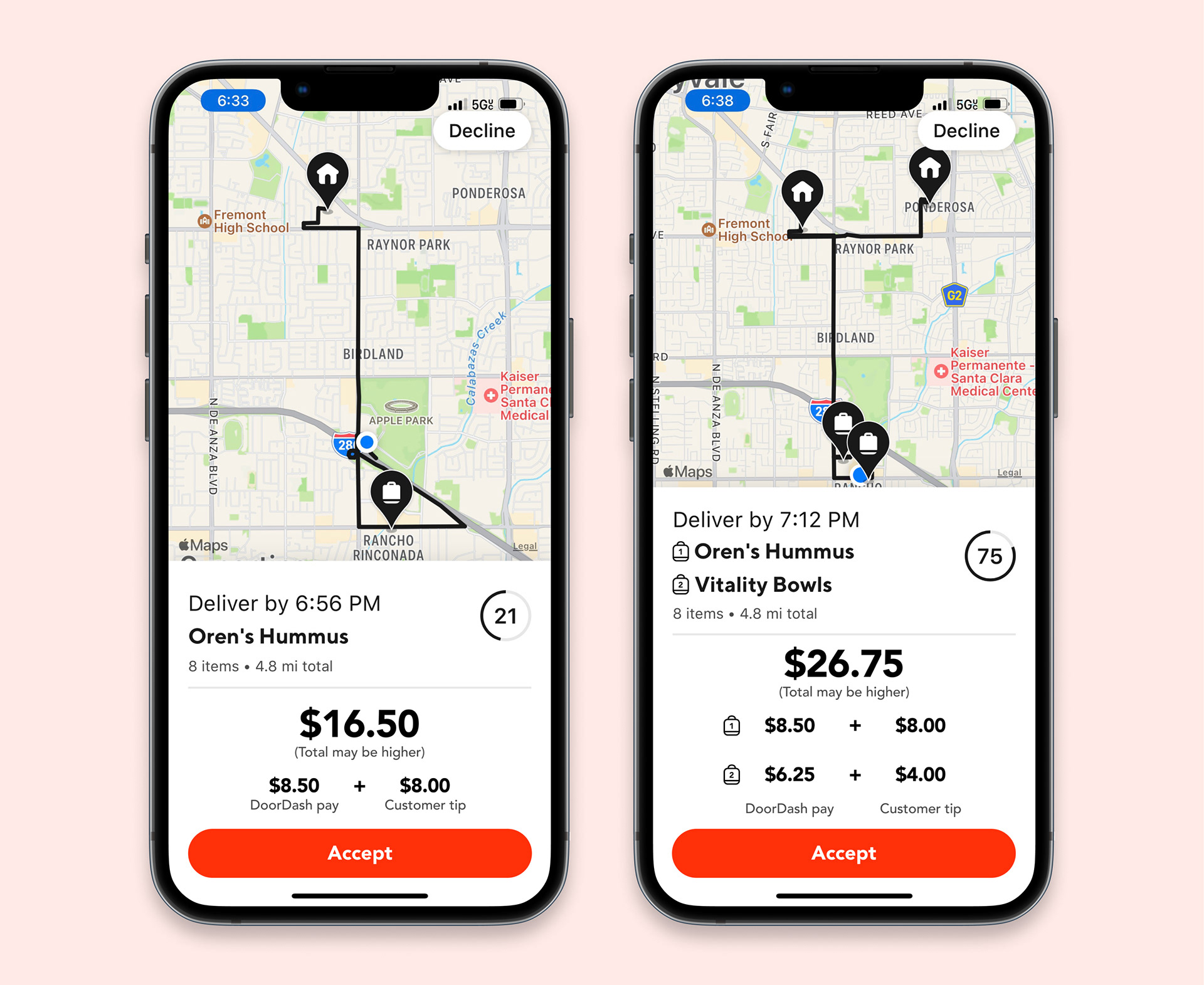
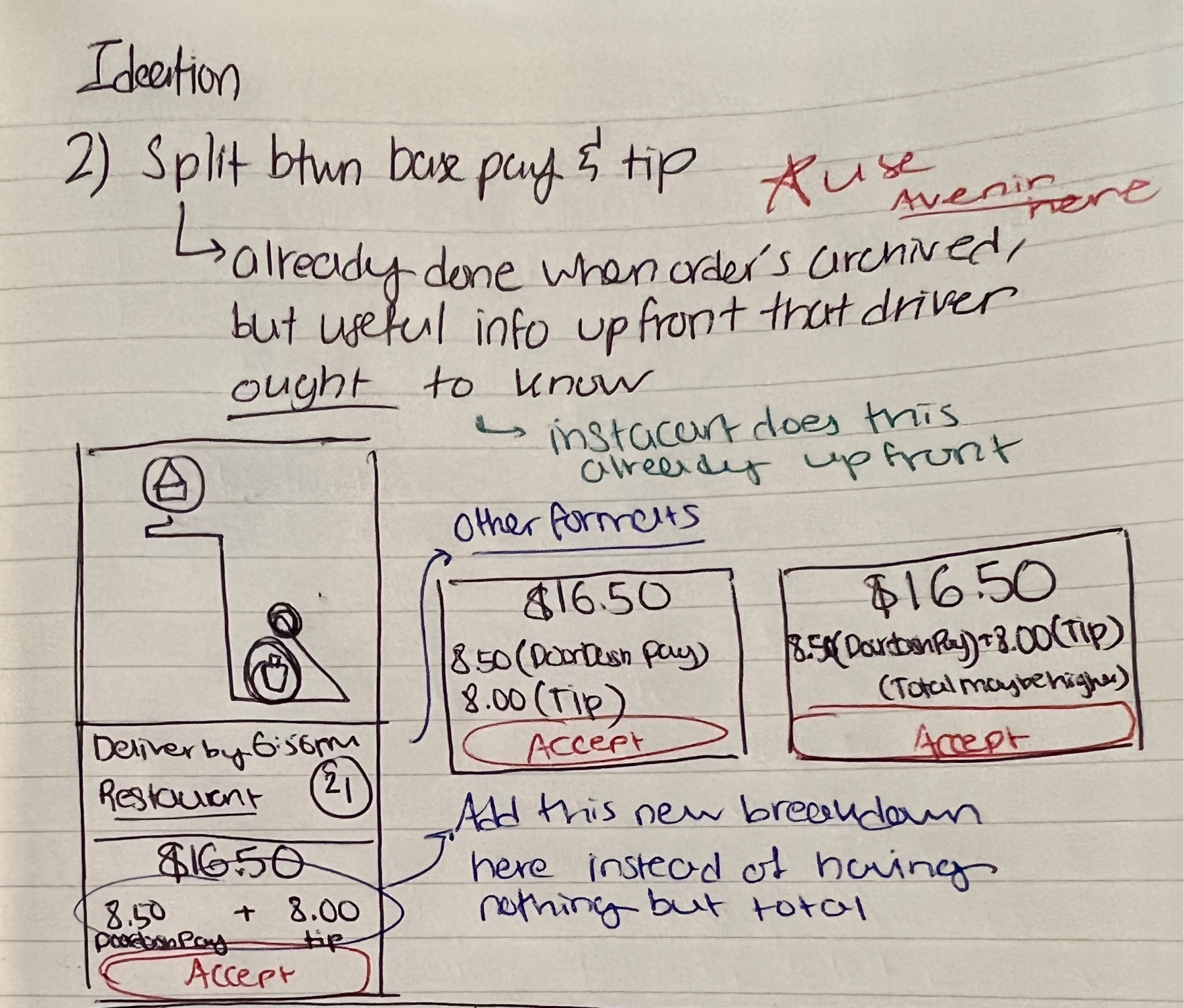
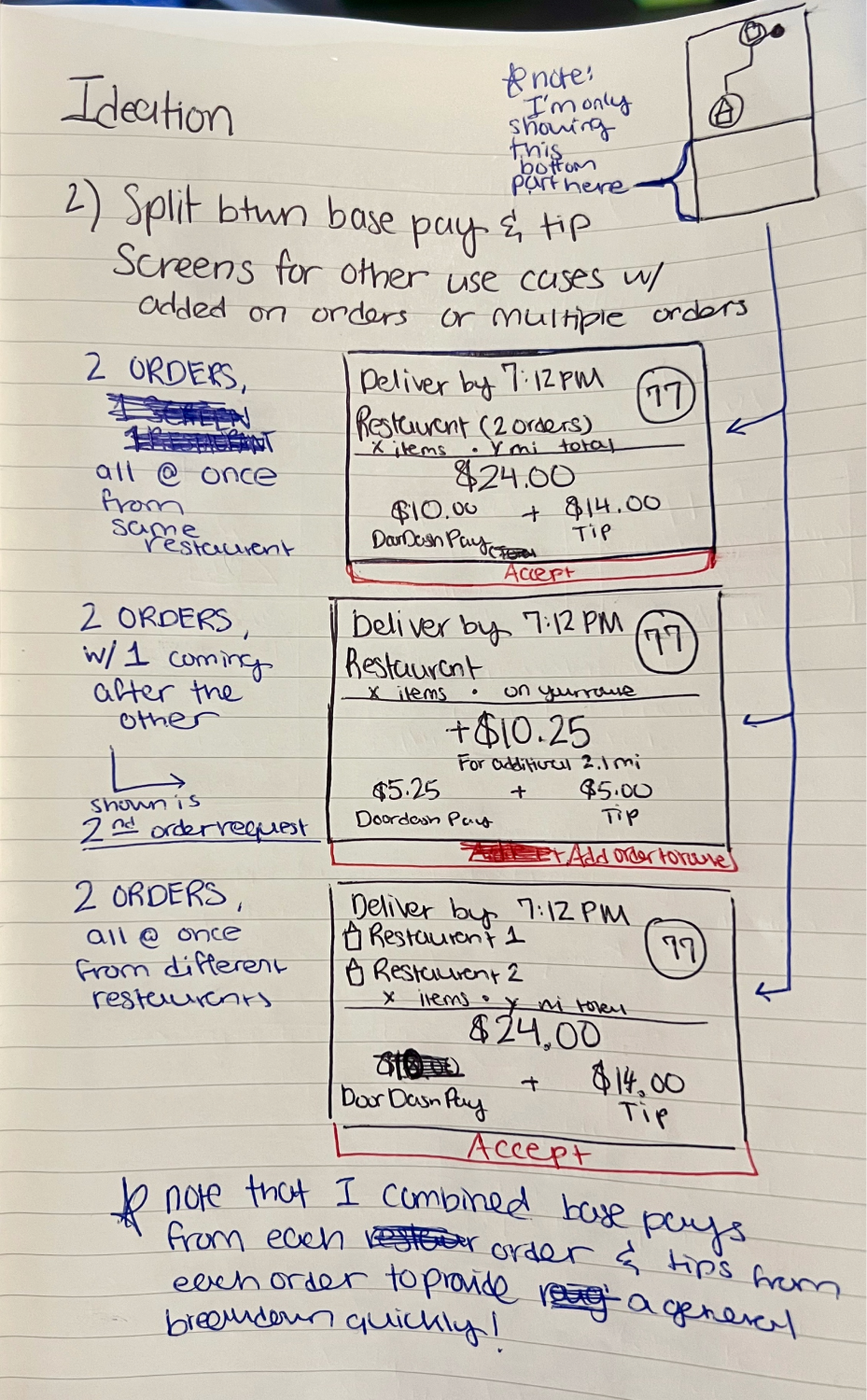
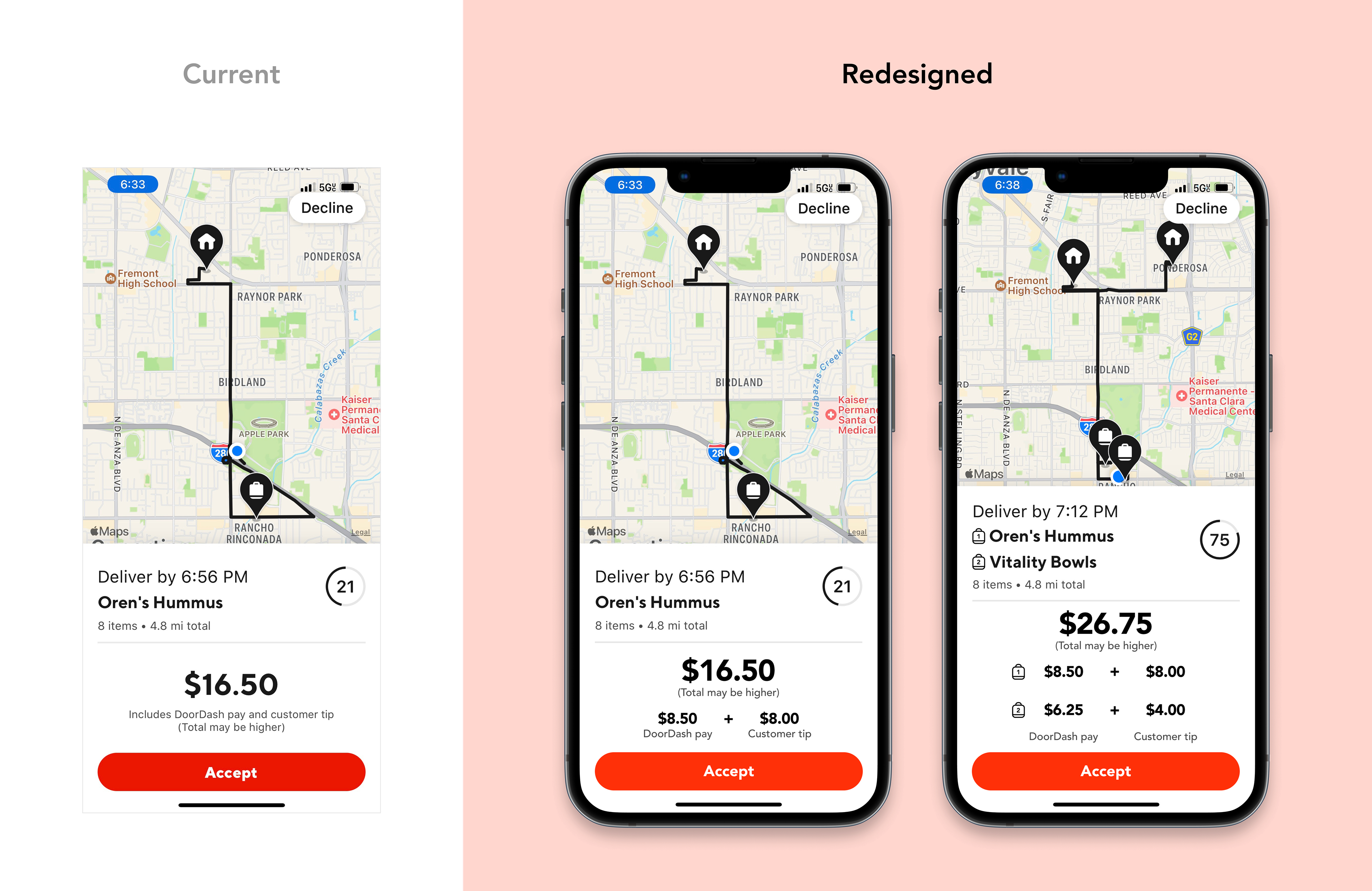
2. How might Dashers gain better earnings transparency?
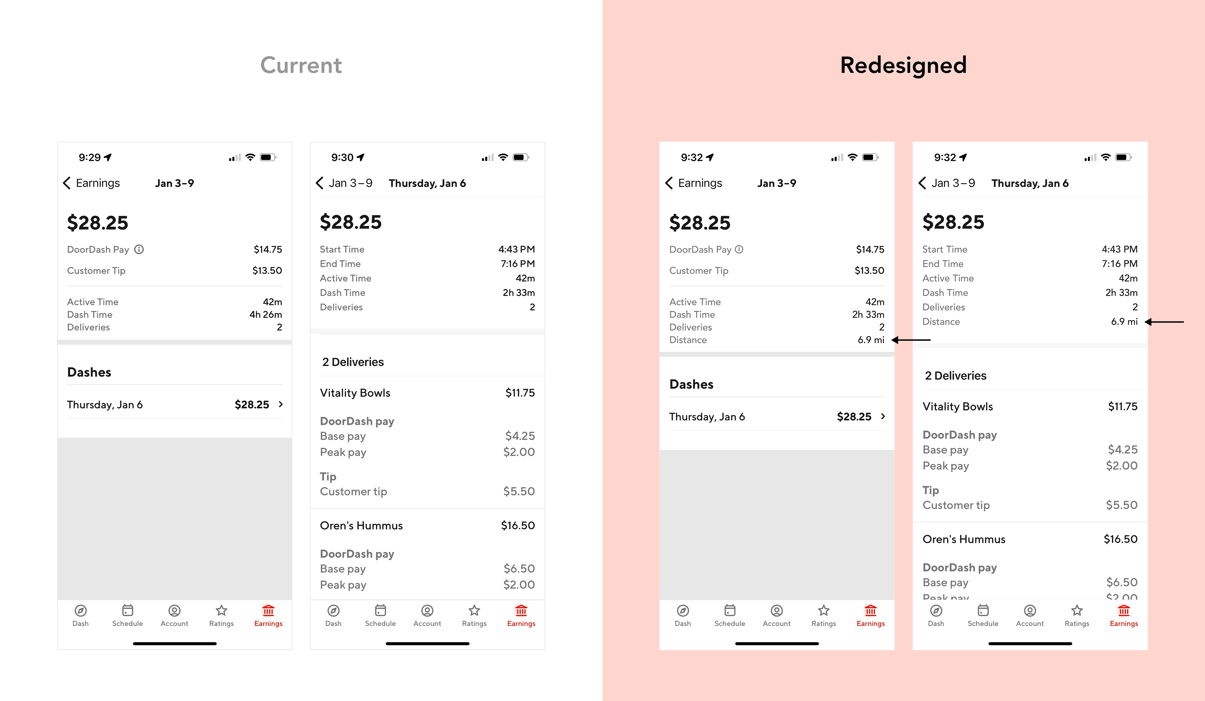
DoorDash doesn't show the earnings breakdown between DoorDash pay and customer tip for an order until after it has been delivered, a major concern based on my research among Dashers.
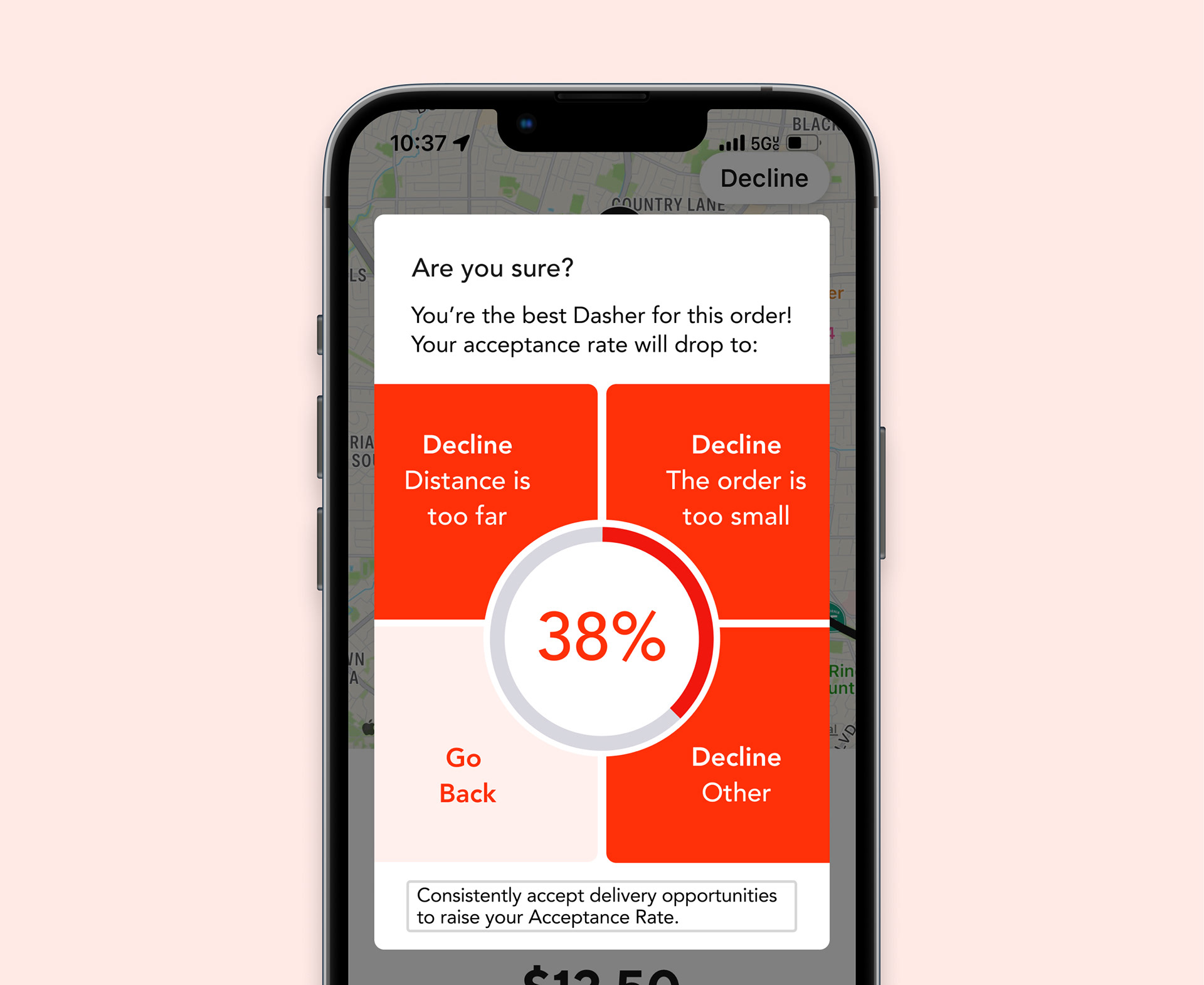
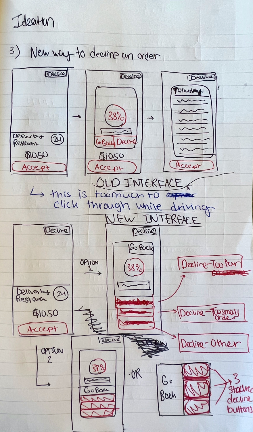
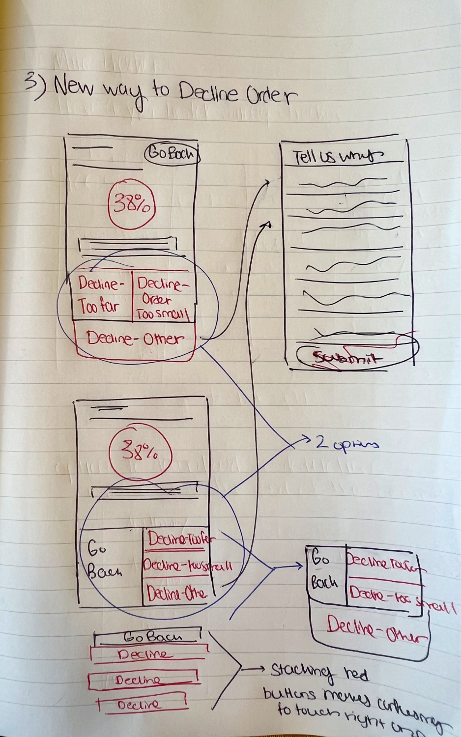
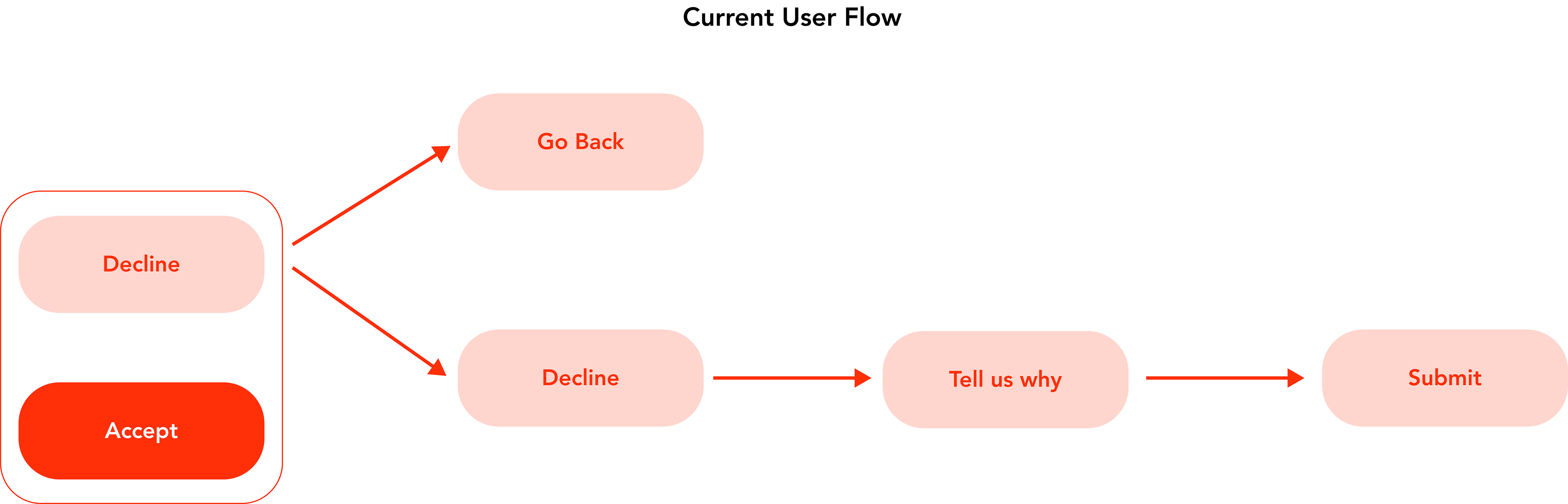
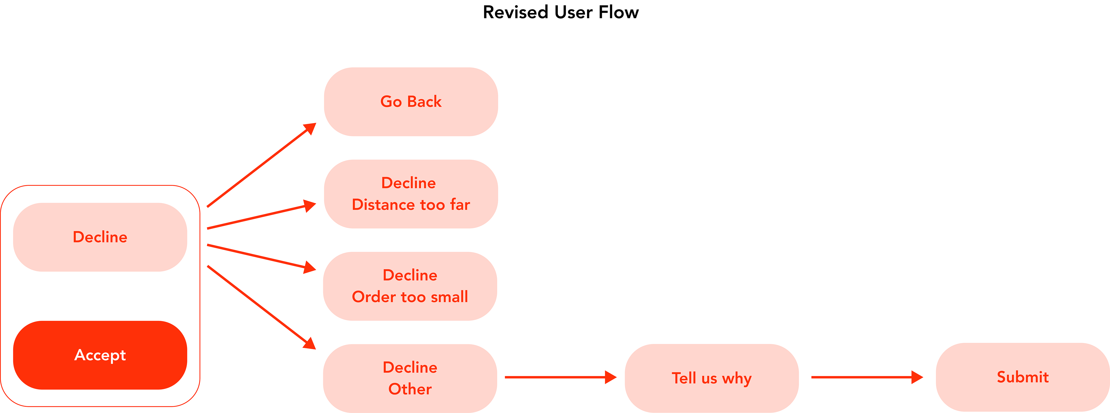
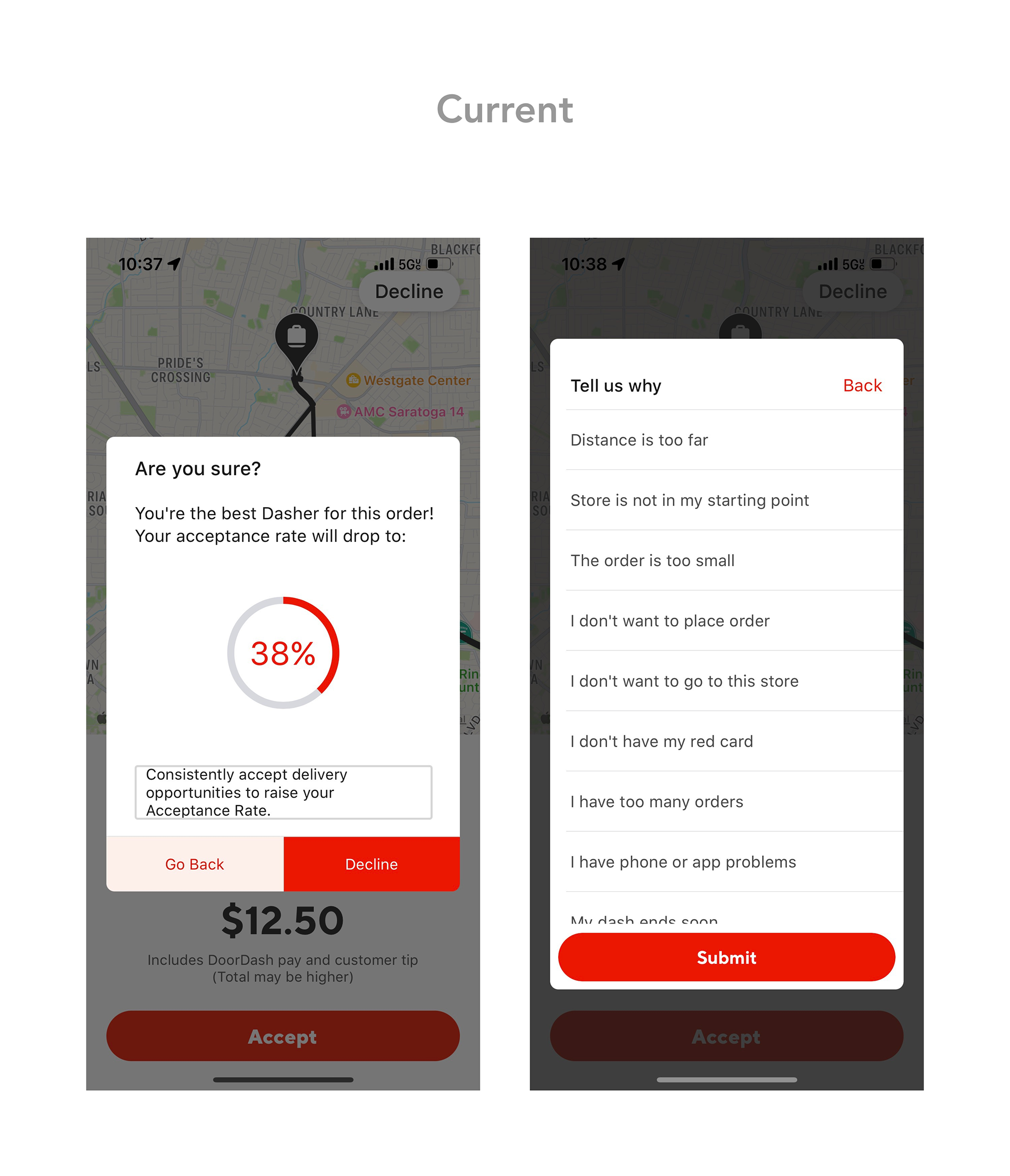
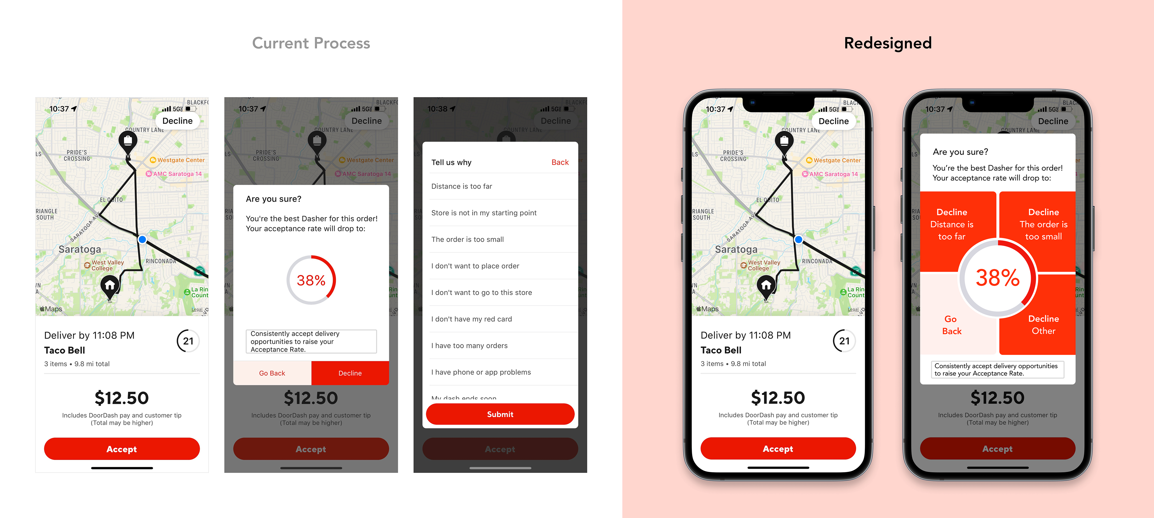
3. How might Dashers decline orders in a safer, more efficient manner?
The myriad of buttons and screens one must click through to decline an order is not only distracting but particularly dangerous to Dashers while driving and can violate state hands-free driving laws.
Ideation
Mileage Tracker
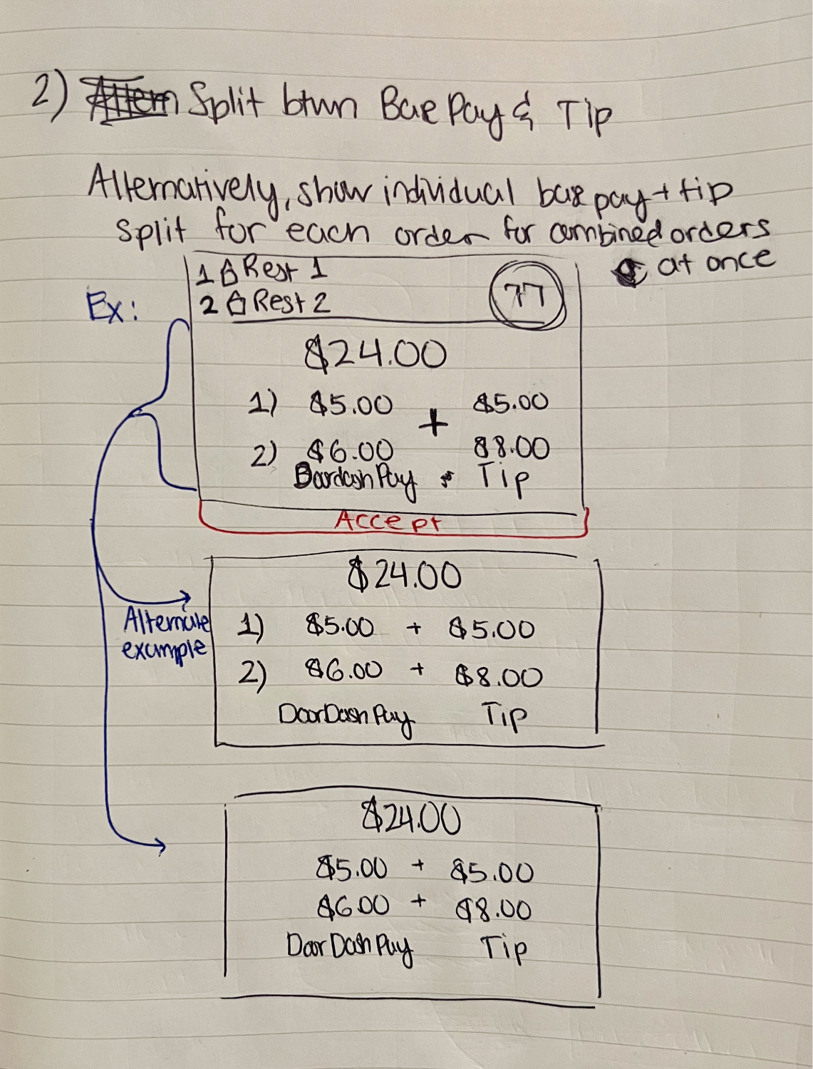
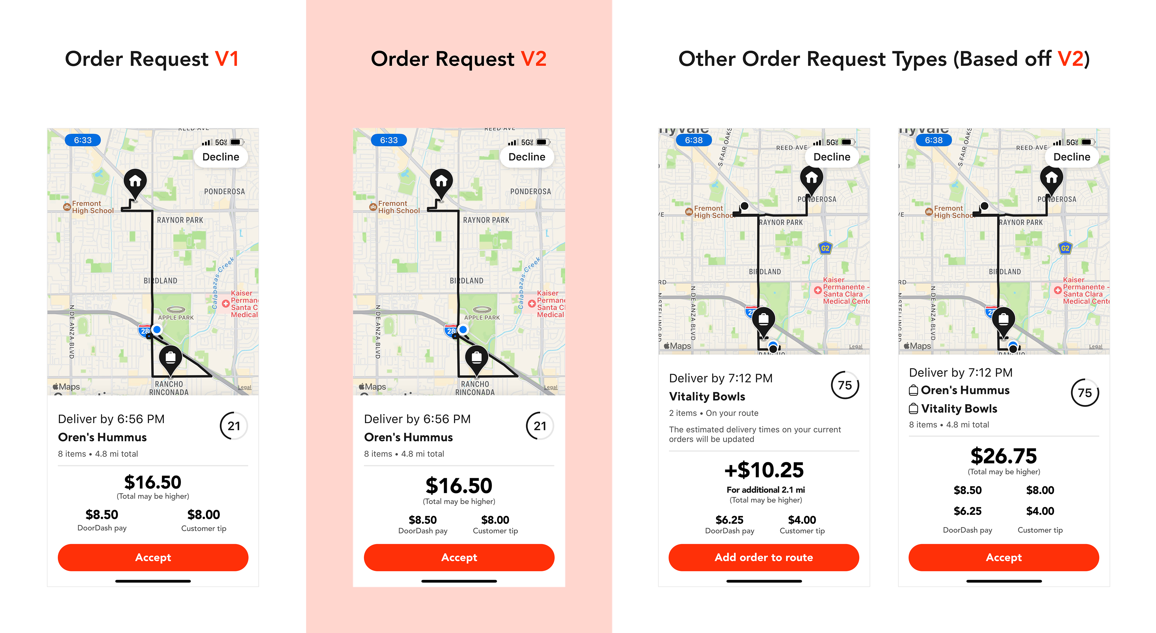
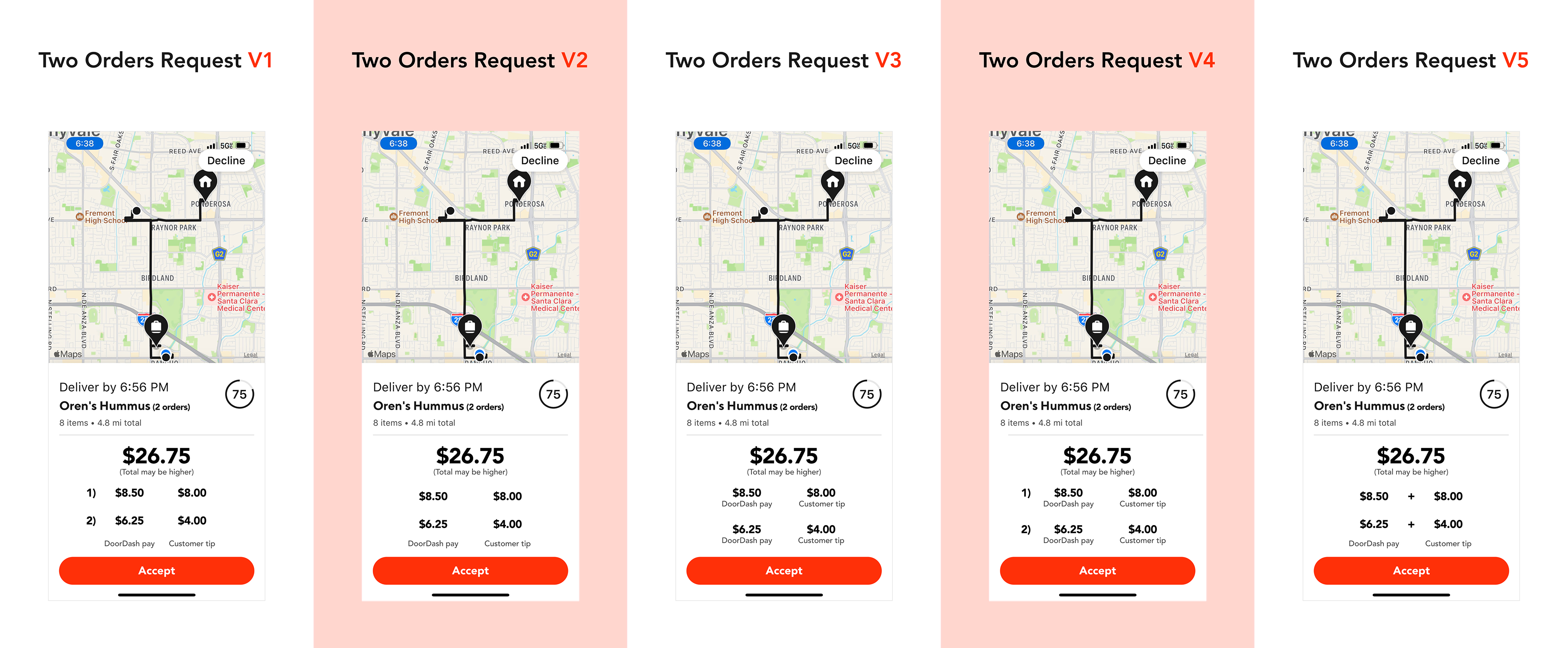
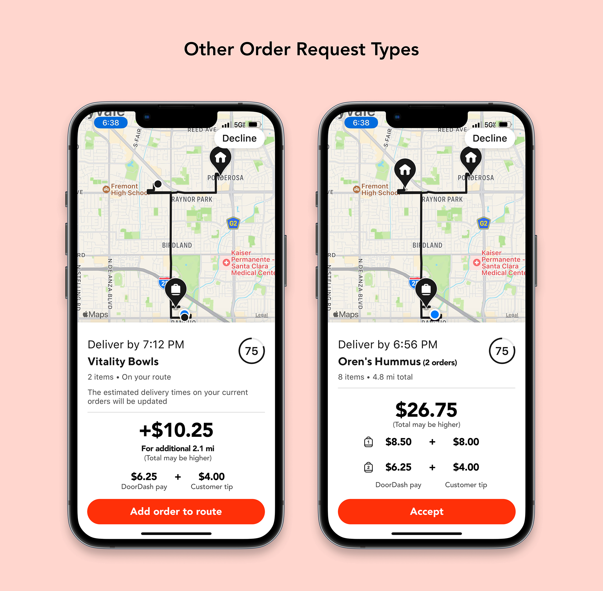
Order Request Pay Breakdown
Decline Orders
Design Explorations
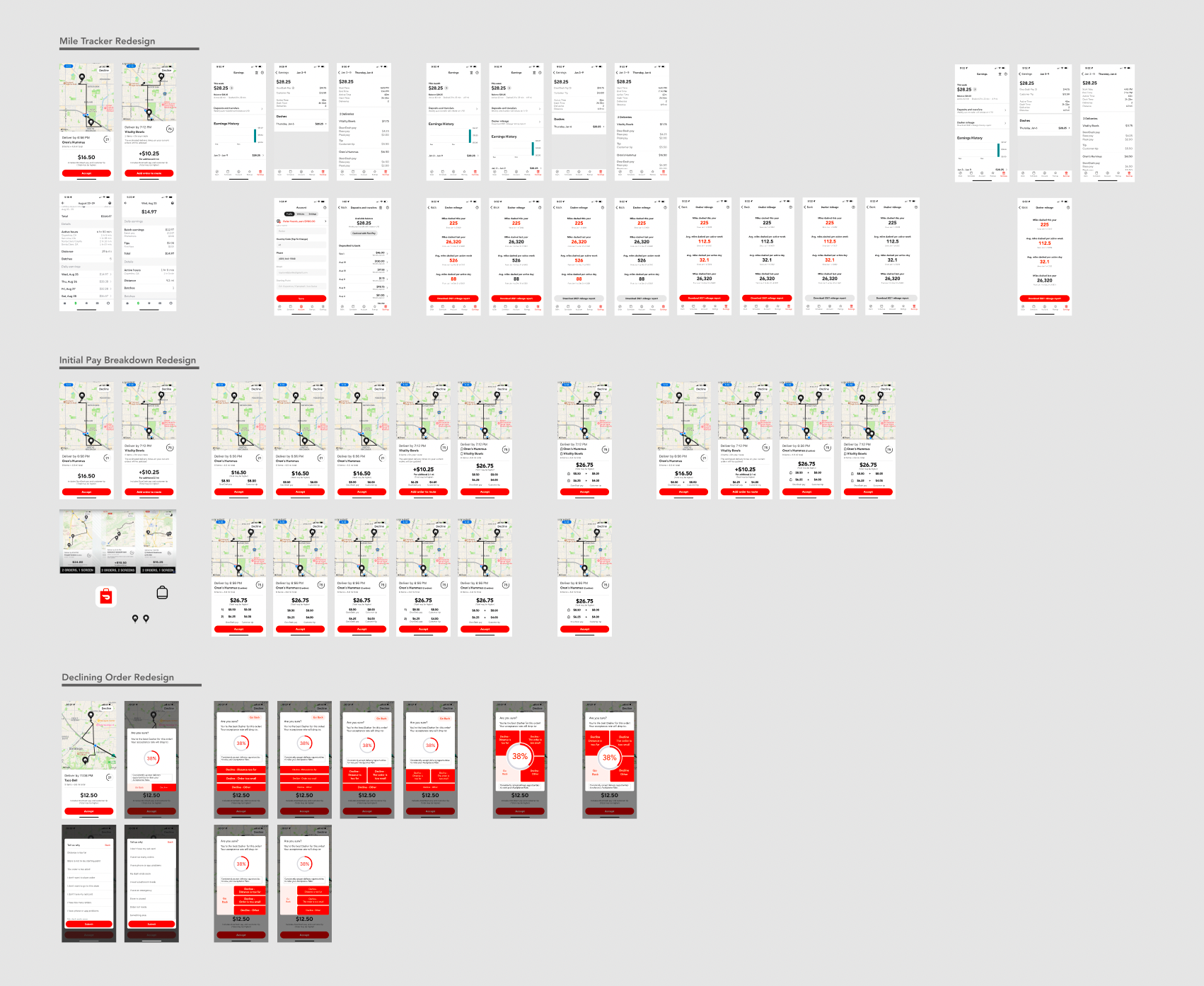
My workflow in Figma designing various app features.
Mileage Tracker
Order Request Pay Breakdown
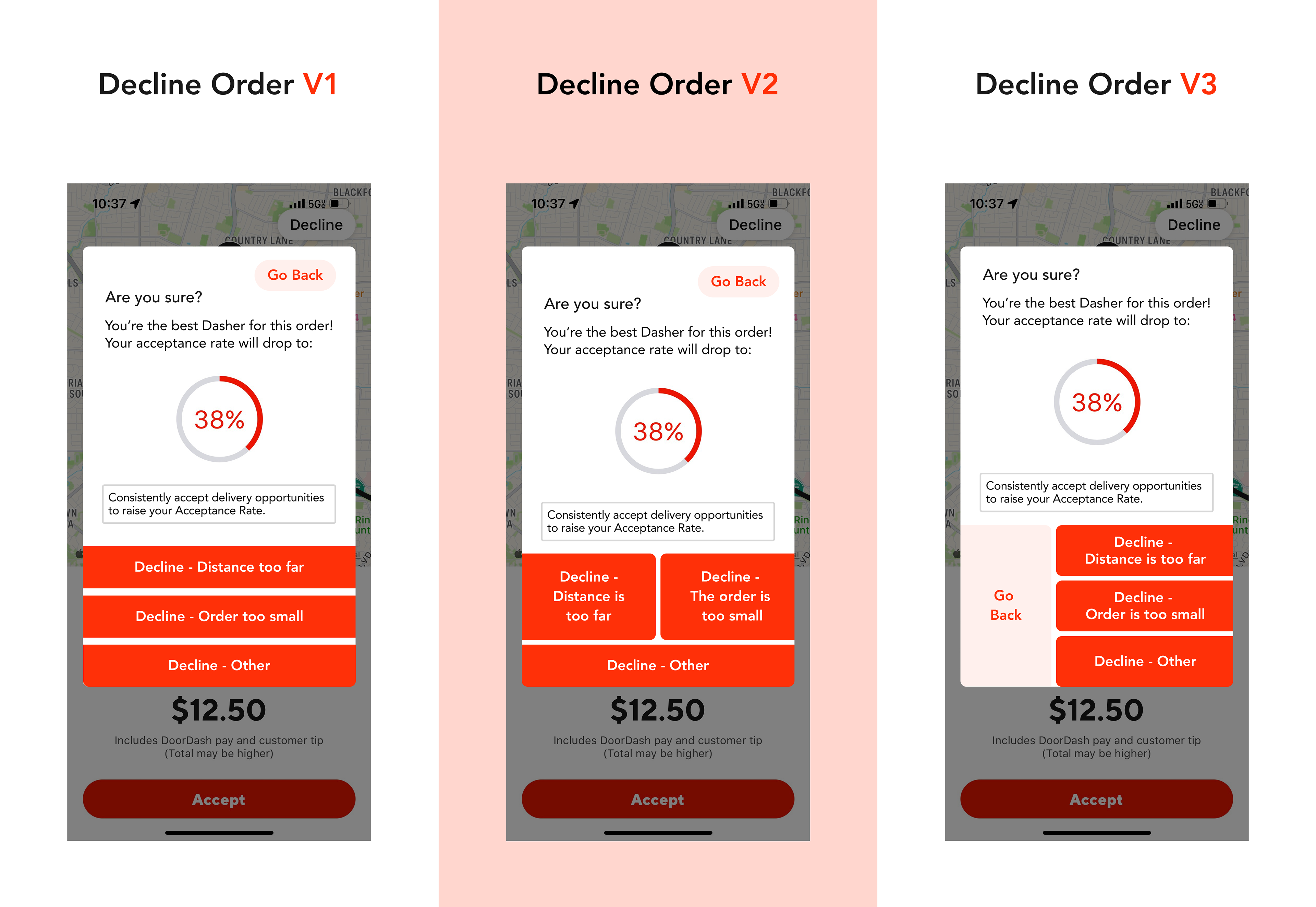
Decline Order Pop-up
Feedback
I asked two Dasher friends who had previously filled out my survey for feedback on each of the designs.
The first user has been a Dasher for over a year.
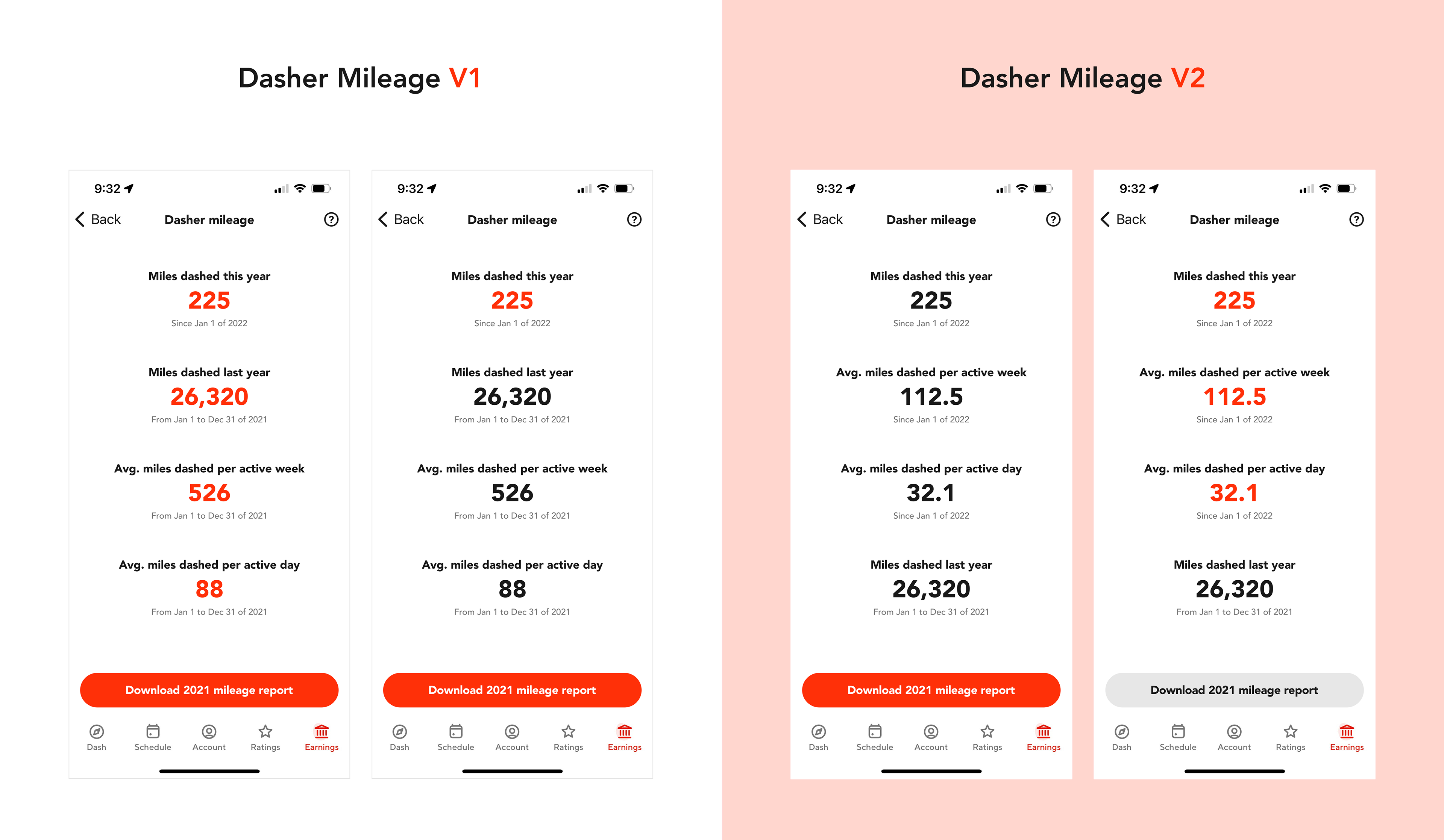
Mileage Tracker
Liked Dasher Mileage V2 best.
"The red [download mileage report] button is in line with DoorDash's style too,... I feel [DoorDash] action buttons should always be red."
Order Request Pay Breakdown
Felt the "1)" and "2)" numerals make things a bit cramped and that the plus signs weren't exactly necessary.
Decline Order Pop-up
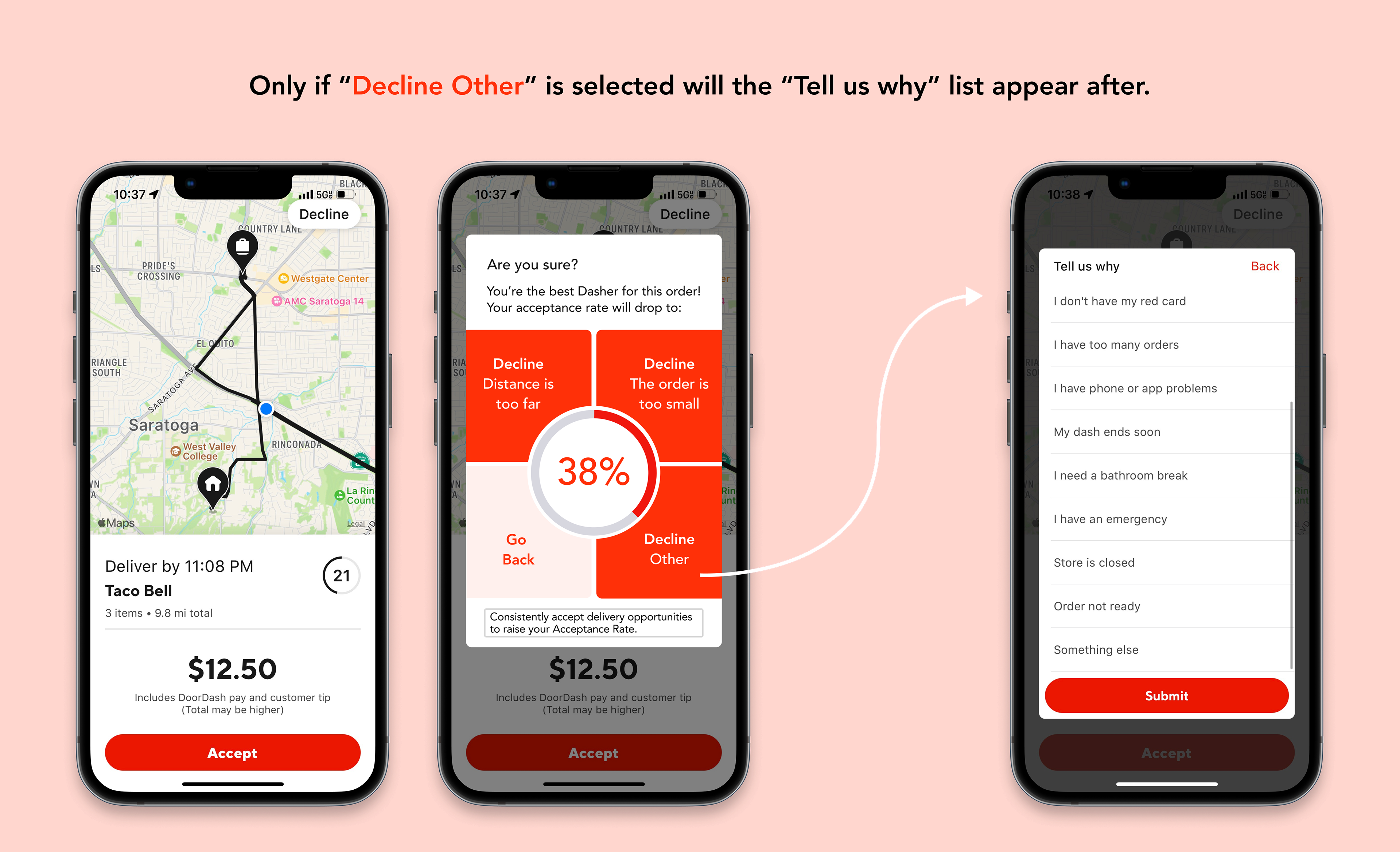
Agreed on keeping the decline a 2-step process, only if you click "Decline other" does the original "Tell us why" menu appear.
Not a fan of any version's UI. Proposed speedometer-like design where there are 4 options (3 decline buttons, go back) nestled around the acceptance rate circle.
The second user dabbles in UX design and dashed for under a year.
Mileage Tracker
Had no concerns with the design of Dasher Mileage V2.
Order Request Pay Breakdown
"Having the captions under both orders’ dollar amounts in V3 and V4 is kinda funky, and I don’t particularly like the "1)" and "2)" style of numerals."
Felt the "+" is a good connector that fills the void between the amounts.
Decline Order Pop-up
Too many red buttons on the bottom encourages declining orders, not advantageous for DoorDash.
Appreciated the idea of incorporating common decline reasons into the buttons.
Liked the speedometer design idea for a decline order pop-up.
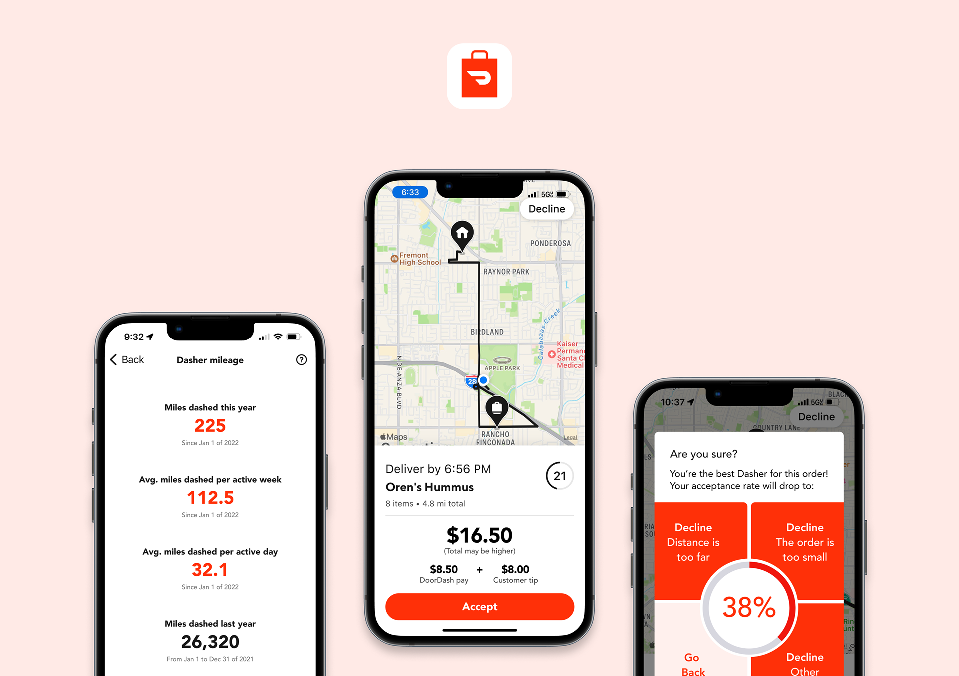
Final Designs
A new way for Dashers to track their mileage within the app.
A new order request screen that immediately shows Dashers their earnings breakdown.
A safer, more efficient way to decline orders.
Reflection
Redesigning three different features of a widely-used mobile application within a week proved to be very tedious yet rewarding. I'm grateful to have learned much more about mobile app design in this project and effective methods of quickly crowdsourcing user research. It also was fun to fire up the Dasher app and go on a few Dashes again.
Looking back, I probably would have chosen to focus on redesigning just the decline feature of the Dasher app and testing it more through interactive mockups. Given the differing opinions about the placement of the “Go Back” button, it also would have been beneficial to have iterated further upon the order decline design. Additionally, I wish I could have run my Google survey for longer to collect more data. Nevertheless, I'm very satisfied that I ultimately solved all three original problems that I identified, and completing this case study has made me all the more excited to work on future product design challenges.
One problem area that I wish I could have tackled was finding a way to help Dashers deliver food to apartment complexes. 86.4% of Dashers I surveyed mentioned having past trouble understanding the layout of a complex and finding the customer's apartment, especially at night or when it's dark out. Unfortunately, Google and Apple Maps are not capable of providing walking directions to a specific apartment house number, even if it's outside.
Acknowledgements
Special thanks to my homie and Dasher buddy Arnav for all the user research and feedback he provided during this design sprint. No matter how many times I texted him a wireframe mockup late into the night, he'd always respond with insightful critique, and his feedback was instrumental to the final order decline design.
Shoutouts as well to my friends Jeremy and Cameron for their thoughtful feedback on the prototypes and general willingness to listen to me ramble about design. Finally, big thanks to my friend Angel for pushing me to apply to the KP Fellows Program in the first place and coaching me along the way.